Rakesh Chada's Blog Deep Learning & Natural Language Processing
Understanding Neural Networks by embedding hidden representations
An interactive visualization of word embeddings
It’s always great fun to visualize neural networks. We previously saw how visualizing a neuron’s activation revealed fascinating insights. For a supervised learning setting, the training process of a neural network can be thought of as learning a function that transforms a set of input data points into a representation in which the classes are separable by a linear classifier. So, this time, I was interested in producing visualizations that shed more light into this training process by leveraging those (hidden) representations. Such visualizations can reveal interesting insights about the performance of the neural network.
I brainstormed several ideas and ended up getting a great foundation from the excellent Andrej Karpathy’s work.
The idea is simple and can be illustrated briefly in the steps below:
- Train a neural network.
- Once it’s trained, produce the final hidden representation (embedding) for each data point in the validation/test data. This hidden representation is basically the weights of the final layer in the neural network. This representation is a close proxy to what the neural network thinks about data for it to classify.
- Reduce the dimensionality of these weights to be either 2-D or 3-D for visualization purposes. Then, visualize these points on a scatter plot to see how the they are separated in space. There are popular dimensionality reduction techniques such as T-SNE or UMAP for this purpose.
While this illustration visualizes the data points after the training had completed, I thought an interesting extension would be to instead visualize them at multiple points during the training process. It’s, then, possible to inspect each of those visualizations individually and draw some insights about how things changed. For instance, we could produce one such visualization after each epoch until the training completes and see how they compare. A further extension of this would be to produce an animation of these visualizations. This can be done by taking each of these static visualizations and interpolating points between them - thereby leading to point-wise transitions.
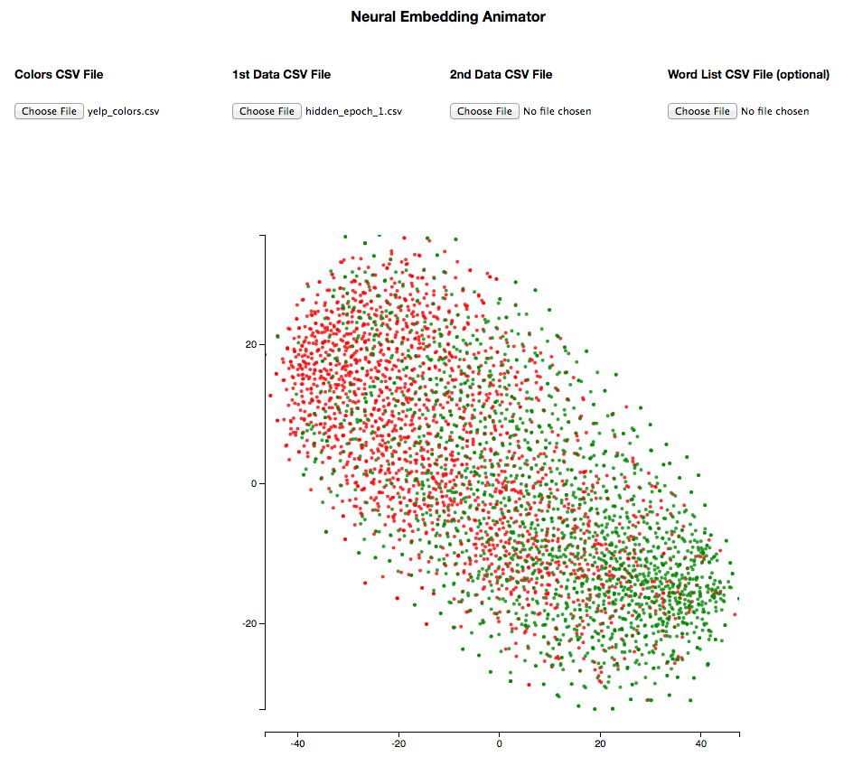
This idea got me excited and I went on to develop a D3.js based Javascript tool that enables us to produce these visualizations. It lets us produce both static visualizations and animations. For animations, we would need to upload two csv files, containing hidden representations, that we want to compare, and it can animate the points across those. We also have control of the animation so we could observe, for instance, how a specific set of points move over the course of the training process. An example of this can be seen at the beginning of this post. Feel free to play around with it!
Link to the tool: Neural Embedding Animator
README for the tool: README
This is by no means a sophisticated tool. I just wanted to put up something quick that lets me visualize and this is what I came up with.
A big catch with the animation approach - that I should illustrate upfront is - the inconsistency in each of the individual 2-D/3-D representations after T-SNE/UMAP is performed. Firstly, one has to be extra careful in setting the hyper-parameters, setting a random seed etc. And secondly, as far as I understand, T-SNE just tries to embed in such a way that similar objects appear nearby and dissimilar objects are far apart. So when we animate across two visualizations, say epoch 1 and epoch 2, it might not be easy to distinguish the movements that were caused by pure randomness versus the change in weights from the actual learning of the neural network. That said, in my experimentation, I was sometimes able to produce reasonable animations that helped me derive interesting insights.
Here’s a sneak peek of an animation:
This visualization framework has multiple interesting applications. Here are a few in the context of classification problems:
- Gaining a better understanding of the model’s behaviour w.r.t data
- Understanding evolution of data representations during a neural network’s training process
- Comparing models on a given data set - both in terms of hyper-parameter changes or even the architectural changes
- Understanding how embeddings change in time (when tuned) over the training process
The rest of this post illustrates each of the above with specific real-world examples.
Gaining a better understanding of the model’s behaviour w.r.t data
Toxic comment classification task
The first example we would use here is this interesting Natural Language Processing contest from Kaggle that was going on at the time I was developing this tool. The goal was to classify text comments to different categories - toxic, obscene, threat, insult & so on. It’s a multi-label classification problem.
Among the neural network models, I tried several architectures starting from the simplest (feed-forward neural networks without convolutions/recurrences) to more complex ones. I used binary cross entropy loss with sigmoid activation in the final layer of the neural network. This way - it just outputs two probabilities for each label - thereby enabling multi-label classification.
We will use the hidden representations from a Bi-directional LSTM initialized with untuned pre-trained word embeddings for this demonstration.
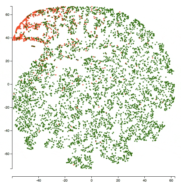
So I did the same steps described above - extracted hidden representations of each text comment in the validation set from the final layer, performed T-SNE/UMAP to shrink them to 2 dimensions and visualized them using the tool. The training went on for 5 epochs before early stopping kicked in. An advantage with using UMAP is that it’s an order of magnitude faster and still produces a high quality representation. Google did release real-time TSNE recently but I didn’t get to explore that yet.
Here’s a zoomed-in version of the visualization at the end of epoch 5. The class being visualized is insult. So red dots are _insult_s and green dots are _non-insult_s.
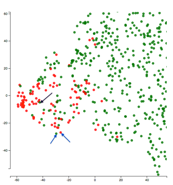
Let’s start with a fun one and look at the two points the blue arrows above are pointing to. One of them is an insult and the other one is not. What do the texts say?
Text1 (green dot with blue arrow): “bullshit bullshit bullshit bullshit bullshit bullshit”
Text2 (red dot with blue arrow): “i hate you i hate you i hate you i hate you i hate you i hate you i hate you”
It’s kind of funny how the model placed the two repetitive texts together. And also the notion of insult seems subtle here!
I was also curious to look at some of the green points in the center of the red cluster. Why might the model have confused about them? What would their texts be like? For example, here’s what the text of the point that the black arrow in the figure above points to says:
“don’t call me a troublemaker you p&&&y you’re just as much of a racist right wing nut as XYZ” (the censors and name omissions are mine - they are not present as such in the text).
Well that does seem like an insult - so it just seems like a bad label! It should’ve been a red dot instead!
It might not be that all these mis-placed points are bad labels but digging deep by visualizing as above might lead to discovering all these characteristics of the data.
I also think this helps us uncover the effects of things such as tokenization/pre-processing on a model’s performance. In the Text2 above, it might have helped the model if there’s proper punctuation - may be a full stop after each i hate you. There are other examples where I felt capitalization might have helped.
Yelp reviews sentiment classification task
I also wanted to try this approach on a different dataset. So I picked this yelp reviews data from Kaggle and decided to implement a simple sentiment classifier. I converted the star ratings to be binary - to make things a bit easier. So - 1, 2 and 3 stars are negative and 4, 5 stars are positive reviews. Again, I started with a simple feedforward neural network architecture that operates on embeddings, flattens them, sends them through a fully connected layer and outputs the probabilities. It’s an unconventional architecture for NLP classification tasks - but I was just curious to see how it does. The training went on for 10 epochs before early stopping kicked in.
Here’s what the visualization’s like at the end of the last epoch:
![]()
The text pointed to by the black arrow says:
“food has always been delicious every time that i have gone here. unfortunately the service is not very good. i only return because i love the food.”
This seems like a neutral review and probably a bit more leaning towards the positive side. So maybe it isn’t too unreasonable for the model to put that point in the positive cluster. Furthermore, this model treats words individually (no n-grams) and that might explain things like missing the “not” in “not very good” above. Below is the text for the closest positive point to the negative point above.
“love this place. simple ramen joint with a very basic menu, but always delicious and great service. very reasonably priced and a small beautiful atmosphere. definitely categorize it as a neighborhood gem.”
The fact that the model placed the two texts above very close in space probably re-affirms the limitations of the model (things such as not capturing n-grams).
I sometimes imagine this analysis can help us understand which examples are “hard” vs “easy” for the model. This can be understood just by looking at the points that seem misclassified w.r.t their neighbors. Once we gain some understanding, we could then use that knowledge to either add more hand-crafted features to help model understand such examples better or change the architecture of the model so that it will better understand those “hard” examples.
Understanding evolution of data representations during a neural network’s training process
We will use animations to understand this. The way I make sense of the animated visualizations is usually by picking a subset of points and observing how their neighborhood changes over the course of the training. I’d imagine the neighborhood becomes increasingly more representational of the classification task at hand as the neural network learns. Or in other words, if we define similarity relative to the classification task, then similar points would get closer in space as the network learns. The slider in the tool above helps us control the animation while keeping a close watch on a set of points.
Here’s an animation of how the hidden representations of data evolved over the course of 4 epochs - epoch 2 to epoch 5 - for the toxic comment classification task.
I selected a small set of points so it’s easy to observe how they move around. Green points represent non-toxic and red points represent toxic classes.
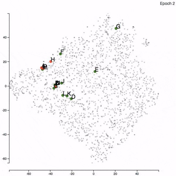
There are pairs of points which dance around quite a bit (F and G or C and I) and there are pairs which remain closeby throughout (D and K or N and O).
So when I manually look at the sentences corresponding to these points, I sometimes could get a sense of what the neural network might have learnt till that epoch. If I see two completely unrelated sentences close together (for instance, E and F in epoch 2), then I imagine it has a bit of learning to do. I sometimes see the neural network place sentences with similar words together - although the overall sentence meaning is different. I did see this effect fade away as the training progressed (and validation loss decreased).
As mentioned in the beginning of the post, this behavior isn’t guaranteed to be consistent. There were definitely times when the neighborhood of a point(s) didn’t make any sense at all. But I do hope that - by producing these animations - and watching out for any striking changes in the movement of points, we’d be able to derive some useful insights.
I also repeated the same experiment with the yelp dataset and discovered similar things.
Here’s what the neural network thinks after 1 epoch of training:
There’s a lot of overlap between the two classes and the network didn’t really learn a clear boundary yet.
Here’s an animation of what the representations evolved to after 5 epochs of training:
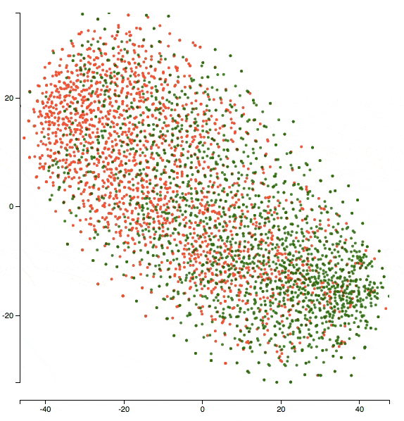
You can see that the two clusters got denser in terms of their respective classes and the network’s doing better in separating the two classes.
Side note: I was doing these animations for representational changes between the epochs. But there’s no reason why one shouldn’t go even more granular - say mini-batches or half-epoch or what not. That might help discover even more granular variations.
Model comparison
This is again pretty straight foward to do. We just pick representations at the end of the last epoch for the models that we want to compare and plug them into the tool.
The two models that I used for comparison here are a simple feedforward neural network (without convolutions or recurrences) and a Bi-directional LSTM. Both of them are initialized with pre-trained word embeddings.
So - for the toxic comment classification challenge - and for the obscene class - this is how the representations changed between the models.
All red dots represent obscene class and the green dots represent non-obscene class.
You can see the BiLSTM here does a better job separating the two classes.
Word embeddings visualization
I should say I love word embeddings and they are a must-try for me in any NLP related analysis. This framework should particularly suit the word embeddings quite well. So let’s see what we can understand about them using this.
Here’s an example animation of the how word embeddings changed when tuned on the yelp task. They were initialized with the 50 dimensional Glove word vectors. This is the same animation that’s in the beginning of the post. The colors are removed and labels are added to a few data points for illustration purposes.
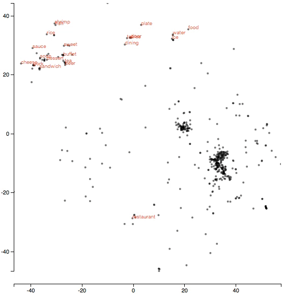
It’s fascinating how the word food which was quite distant in space from the actual instances of food such as ramen, pork, etc moved closer to them as we tuned the embeddings. So the model probably learnt that all those ramen, pork etc are instances of food. Similarly, we also see table move closer to restaurant and so on. The animation makes it very easy to spot these kinds of interesting patterns.
Another fun thing that could be tried is to reverse engineer the tool and do some custom analysis. For instance, I was curious how the embeddings of toxic words changed on the toxic comment classification task described above. I made a model learn embeddings from scratch (so no weights initialization with pre-trained embeddings) on the toxic comment classification task above. I’d imagine it’s a bit of tougher ask to the model given the amount of data - but thought it was worth a shot. The architecture is the same BiLSTM. So I just colored all toxic words to be red and tracked them across the animation. Here’s the animation of the how the embeddings changed: (PG-13 alert!!)
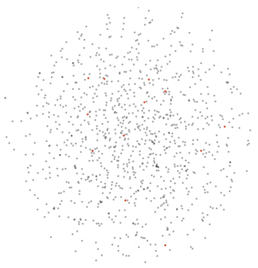
Isn’t that fascinating to watch? The model separated swear words (representing toxicity) into a nice little cluster.
I hope this post shed some light on visualizing the hidden representations of data points in different ways and how they can reveal useful insights about the model. I am looking forward to applying these kinds of analyses to more & more Machine Learning problems. And hopefully others consider the same and gain some value from it. I believe they would help make the machine learning models less black-boxy!
Please feel free to provide any feedback as you deem suitable!
PS: I tried using PCA to reduce the hidden representations to 2 dimensions and then produced animations from these. A good thing with PCA is that it’s not probabilistic and hence the final representations are consistent. However, the local neighborhoods in PCA might not be as interpretable as in T-SNE. So it’s a trade-off but if anyone has other ideas on how to get the best of both the worlds - they are much appreciated!
Written on June 21st , 2018 by Rakesh Chada